Brand Guidelines
Client
Kohana
Date
August, 2025
Services
Brand Guidelines
Project Overview
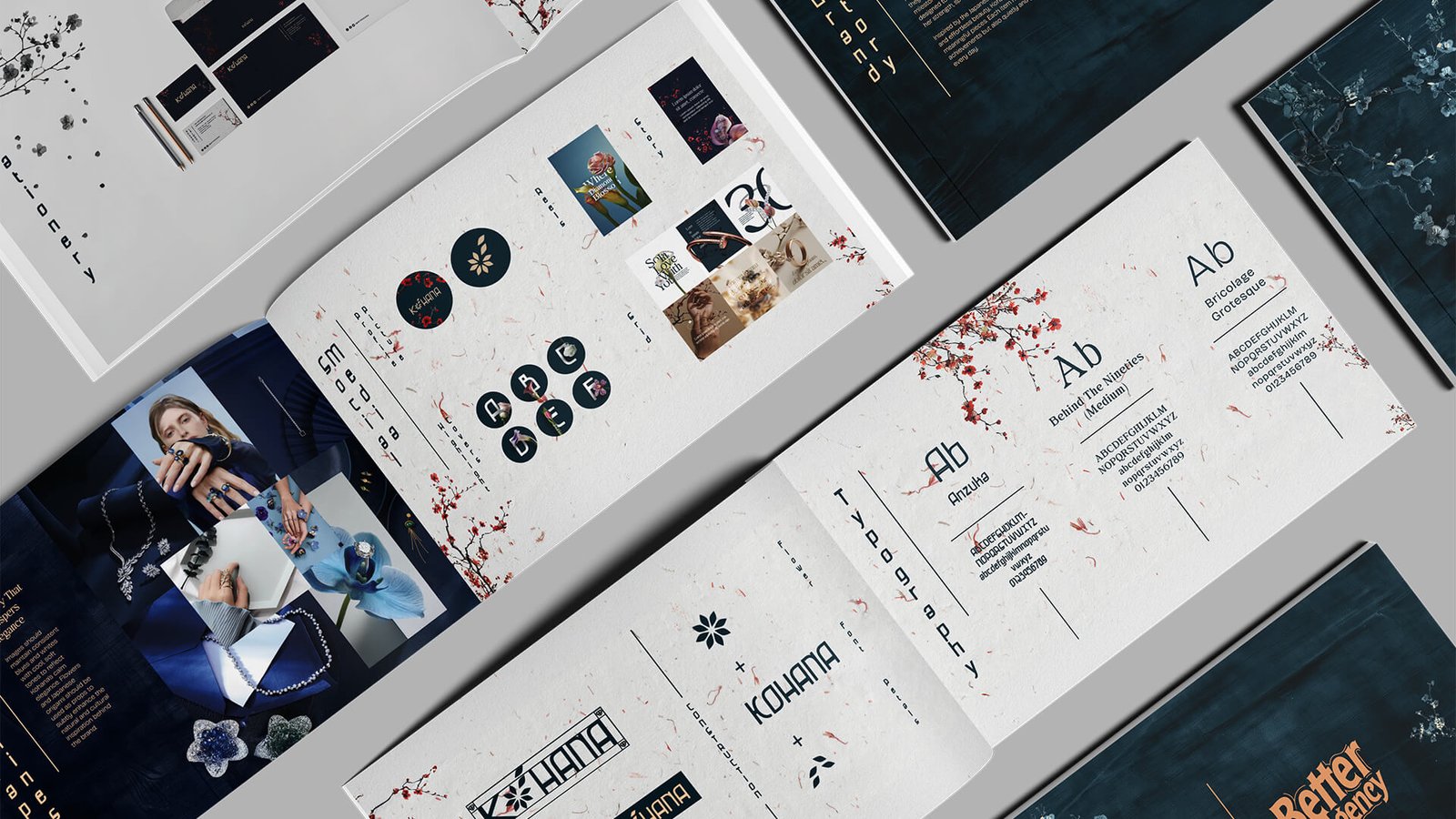
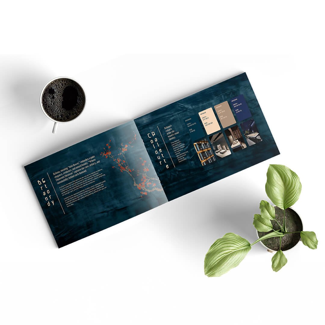
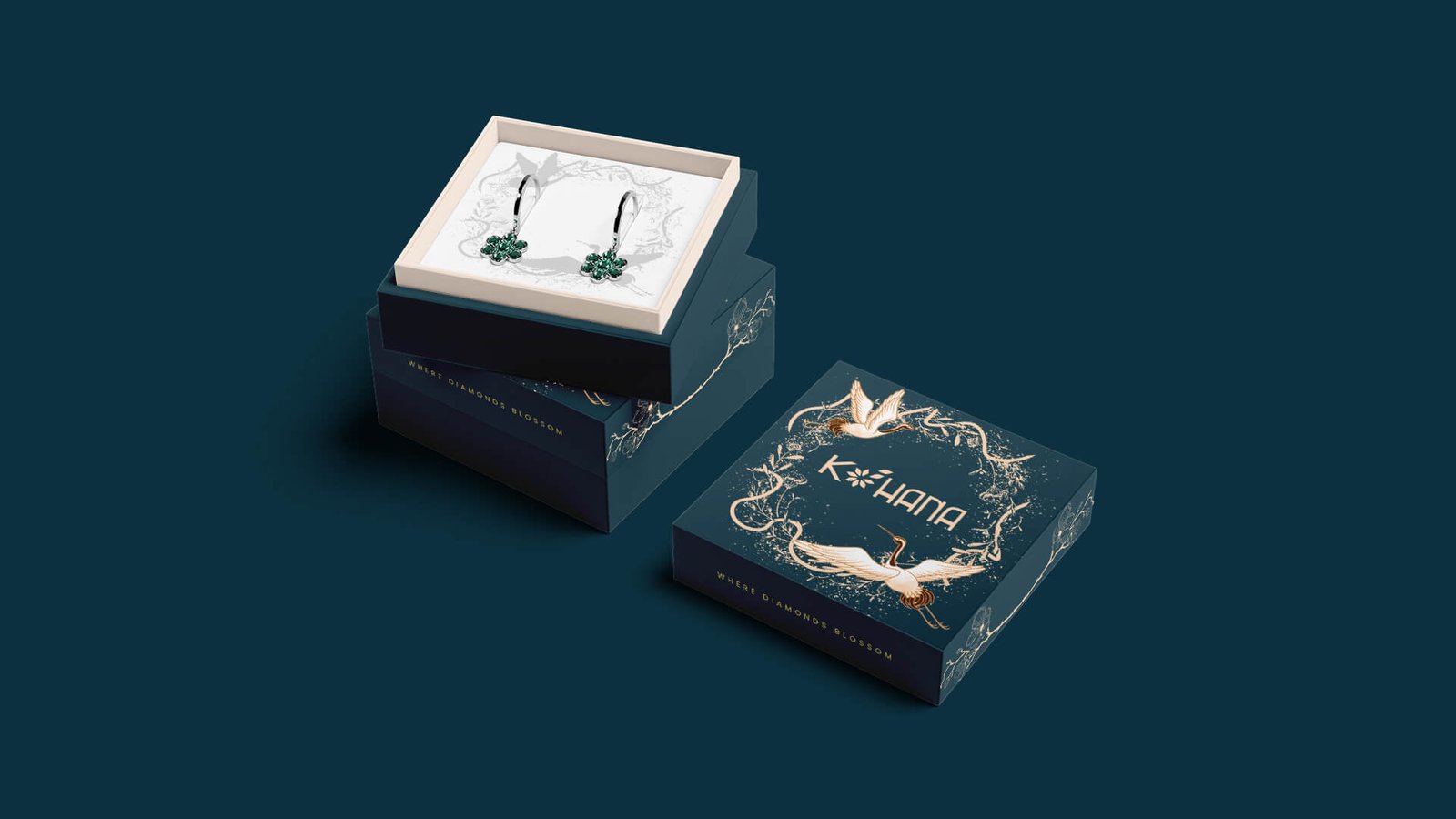
Logo design and brand guidelines were developed for Kohana, an affordable lab-grown diamond brand in India. The brand faced a mismatch between its previous branding and the newly finalized store interiors, which were based on a Japanese tea room concept. To ensure harmony, the branding was created in close collaboration with the interior design team so that the visual identity would complement and elevate the spatial experience. Drawing from the meaning of the name Kohana (“little flower” in Japanese), the identity blends delicate floral symbolism with a refined, feminine luxury. The logo features a flower formed using diamond-inspired shapes, with petal movements reminiscent of cherry blossom art, creating a balance between Japanese aesthetics and modern elegance.
- Logo inspired by a diamond-formed flower with cherry blossom-like flow
- Japanese-influenced typography alignment and layout styling
- Soft, feminine luxury expressed through a refined color palette
- Brand guidelines tailored to enhance the Japanese tea room interior concept
Challenge
The previous agency’s branding conflicted with the finalized interiors, resulting in an inconsistent brand experience. The identity needed to align with the Japanese tea room theme without making the brand resemble a pan-Asian restaurant, while still communicating femininity, affordability, and luxury in the lab-grown diamond space.
- Aligning visual identity with a highly specific interior theme
- Avoiding pan-Asian restaurant cues while using Japanese influence
- Creating a feminine yet premium brand expression
- Developing guidelines that seamlessly integrate with store design
Results
The final branding delivered a cohesive identity that harmonized with the Japanese tea room interiors and strengthened the overall retail experience. The logo and visual system introduced a distinctive aesthetic that felt premium, feminine, and culturally aligned without being thematic or kitschy. The brand guidelines provided clear direction for applications across signage, packaging, and in-store communication, ensuring consistency and elevating the brand’s perceived value.